3. Mapping aboveground biomass
Here we’ll load data from ALOS PALSAR from the year 2007 from near the town of Kadoma in Zimbabwe to show the approach required to make a biomass and a biomass change map.
3.1. Downloading data
Data from the ALOS mosaic are freely available (for non-commercial use) in 1x1 degree tiles. For the purposes of this tutorial, we’ll use the tile at -18 degrees latitude, 29 degrees longitude.
Download the tile here: S18E029.zip (142 MB).
Once the download is complete, unzip and put them in a memorable location (e.g. Desktop).
3.2. Loading data in QGIS
To add data to QGIS, first click the ‘Add Raster Layer’ button:

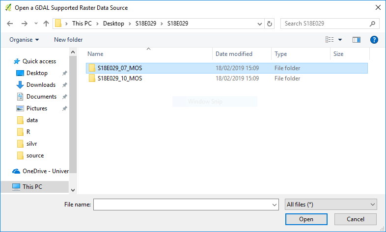
Navigate to the unzipped S18E029 folder, where you’ll find two further folders. The folder S18E029_07_MOS contains data from 2007, S18E029_10_MOS contains data from 2010. We’ll start with 2007.
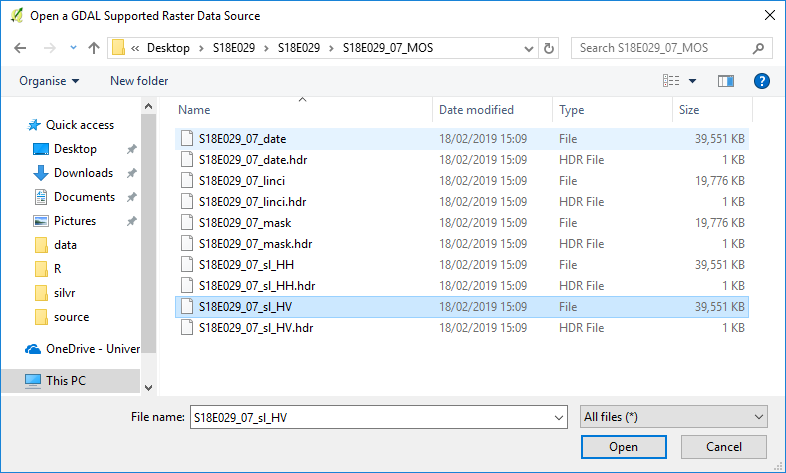
Inside S18E029_07_MOS you’ll find multiple raster files. These describe:
| Filename | What does it show? |
| S18E029_07_date | Image acquisition date |
| S18E029_07_linci | Local incidence angle |
| S18E029_07_mask | Masked values (e.g. water, mountainous terrain) |
| S18E029_07_HH | HH backscatter |
| S18E029_07_HV | HV backscatter (best for biomass mapping) |
See https://www.eorc.jaxa.jp/ALOS/en/palsar_fnf/fnf_index.htm for more details.
We’ll be using S18E029_07_HV, which contains what’s known as cross-polarised backscatter values, which are generally the most sensitive to differences in aboveground biomass.
Click Open, and the image show show on the map canvas.
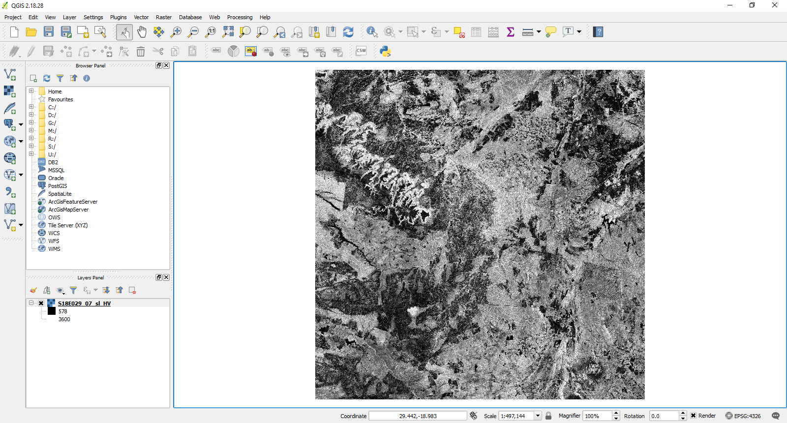
Take some time to explore the image. Can you recognise any features? What land cover types are associated with high backscatter values?
3.3. Calibration of radar backscatter
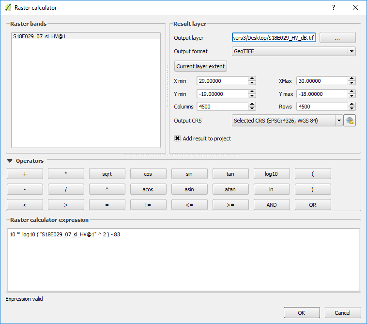
Data from the ALOS mosaic are provided as integers (whole numbers) for efficient storage. The first step of calibration requires converting these values to standard units of radar backscatter, which are decibels. This is done with the following equation:
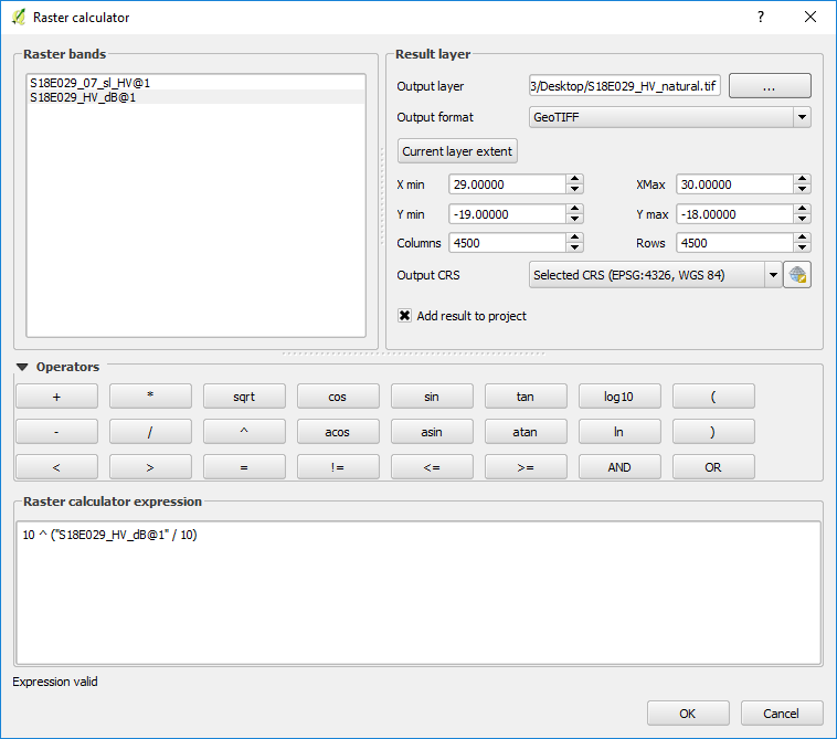
To perform this operation in QGIS, go to the Raster menu and select Raster calculator. In this interface you can slect mathematical operators and rater layers by clicking them. Input the equation as follows, and specify an appropriate output name (e.g. S18E029_HV_dB.tif):
Click OK when ready, and after processing is complete the image will be loaded into the canvas:
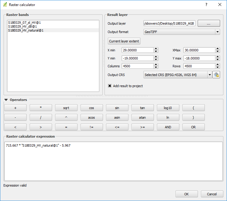
The units of this image are decibels, which is a logarithmic measure of radar backscatter. For our purposes here we’ve calibrated a biomass backscatter relationship in linear units, To convert to linear units (or ‘natural’ units), open the raster calculator once again and perform the following operation:
which can be input with the raster calculator as follows. Give the output image a sensible name (e.g. S18E029_HV_natural.tif):
This will produce an image with values between 0 and ~0.06. If your image has a different range, carefully check your previous steps.
3.4. Calibration to aboveground biomass
The final step is to convert these radar backscatter values to units of aboveground biomass. The best way to do this is to produce a local calibration equation based on large (> 0.5 ha) forest inventory plots that cover a wide range of biomass, but it’s also possible to use a generic equation where local data aren’t available
Here we’ll use a generic equation from McNicol et al. (2018) applicable to southern Africa, which is:
Using the raster calculator and with an appropriate output name (e.g. S18E029_AGB_2007.tif), produce a map of aboveground biomass:
Your output image should have values from around 0 - 40 tC/ha.
3.5. Visualisation
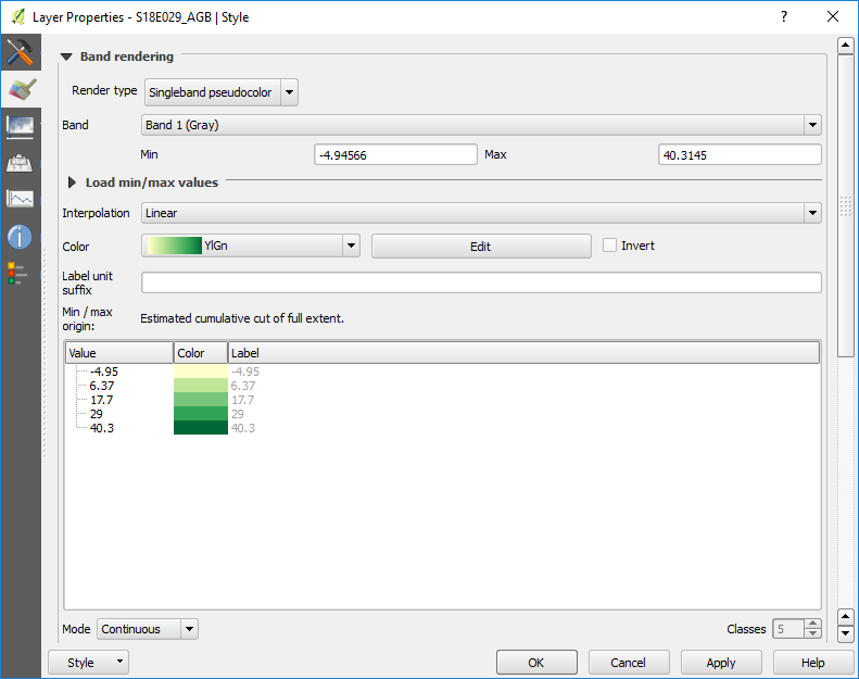
At present the image you’ve produced shows in black and white, which can be difficult to interpret. Double-click on your AGB layer in the Layers Panel, and change Render type to Singleband pseudocolor. Choose an appropriate colour range from the Color pull-down menu (e.g . YlGn), and press OK to apply:
This will change the colours of the image to make it clearer how forest biomass varies across the image:
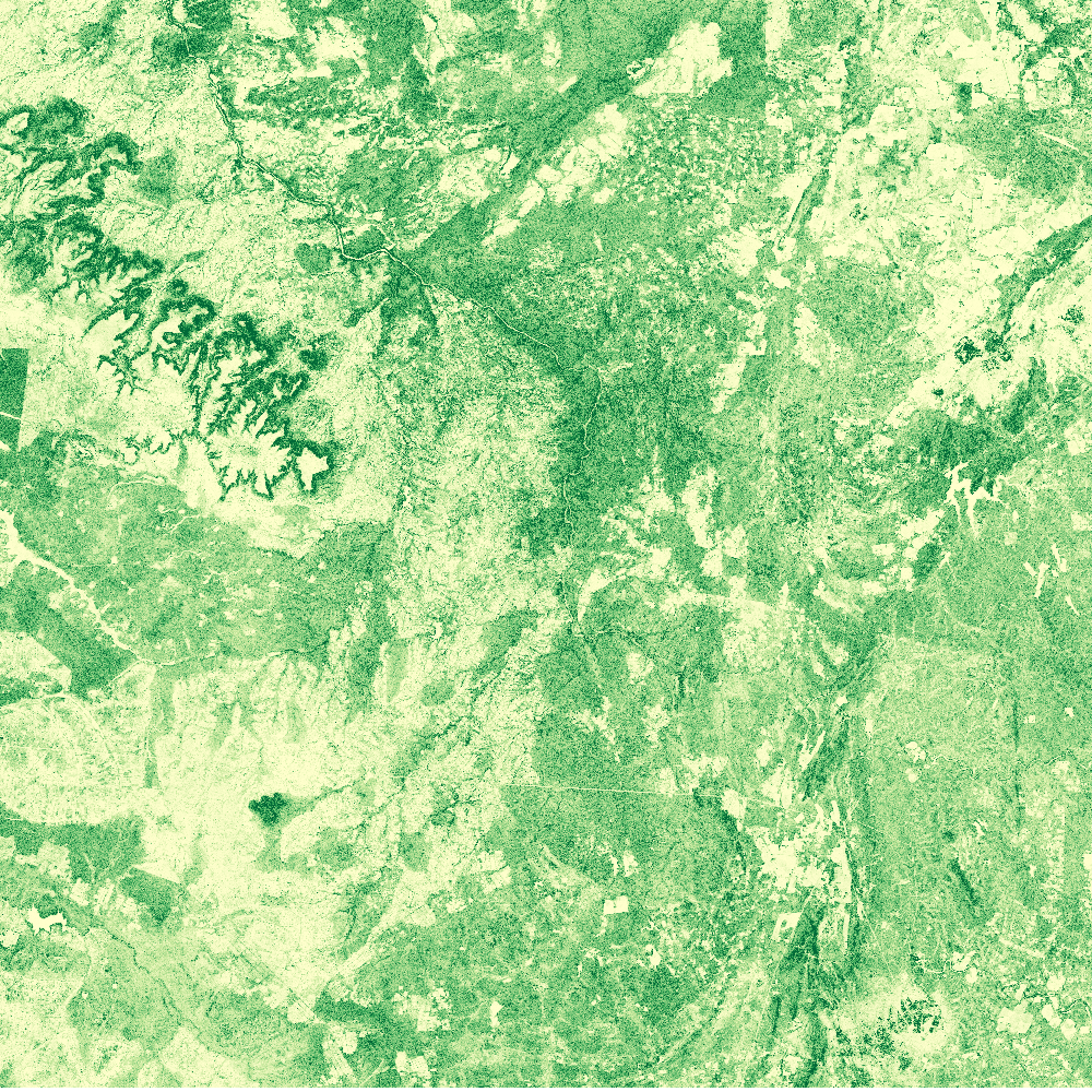
Congratulations, you’ve created a map of aboveground biomass!
Take some time to explore the image. What factors do you think are impacting the distribution of aboveground biomass?