5. Pre-processed change maps
As part of the Satellite Mapping for Forest Management (SMFM: https://www.smfm-project.org), The University of Edinburgh has produced a set of biomass change maps for southern Africa (see https://http://biota.rtfd.io for method). We’ve used a range of techniques to suppress noise in the biomass change maps to generate high quality maps of biomass change, and classify these into different types of change (e.g. deforestation, degradation).
Here we’ll load data outputs from the SMFM project to see what impact this pre-processing has on change map quality.
5.1. Data download
We’ve provided two files containing classes of forest change, one for the period 2007 - 2010, and another for the period 2007 - 2017.
The two files are available here:
ChangeType_2007_2010_S18E029.tif (2.4 MB).
ChangeType_2007_2017_S18E029.tif (2.7 MB).
Download these two files, and save them somwhere memorable (e.g. Desktop).
5.2. Loading data in QGIS
To add data to QGIS, first click the ‘Add Raster Layer’ button:

Navigate to ChangeType_2007_2010_S18E028.tif and add it to the map canvas:
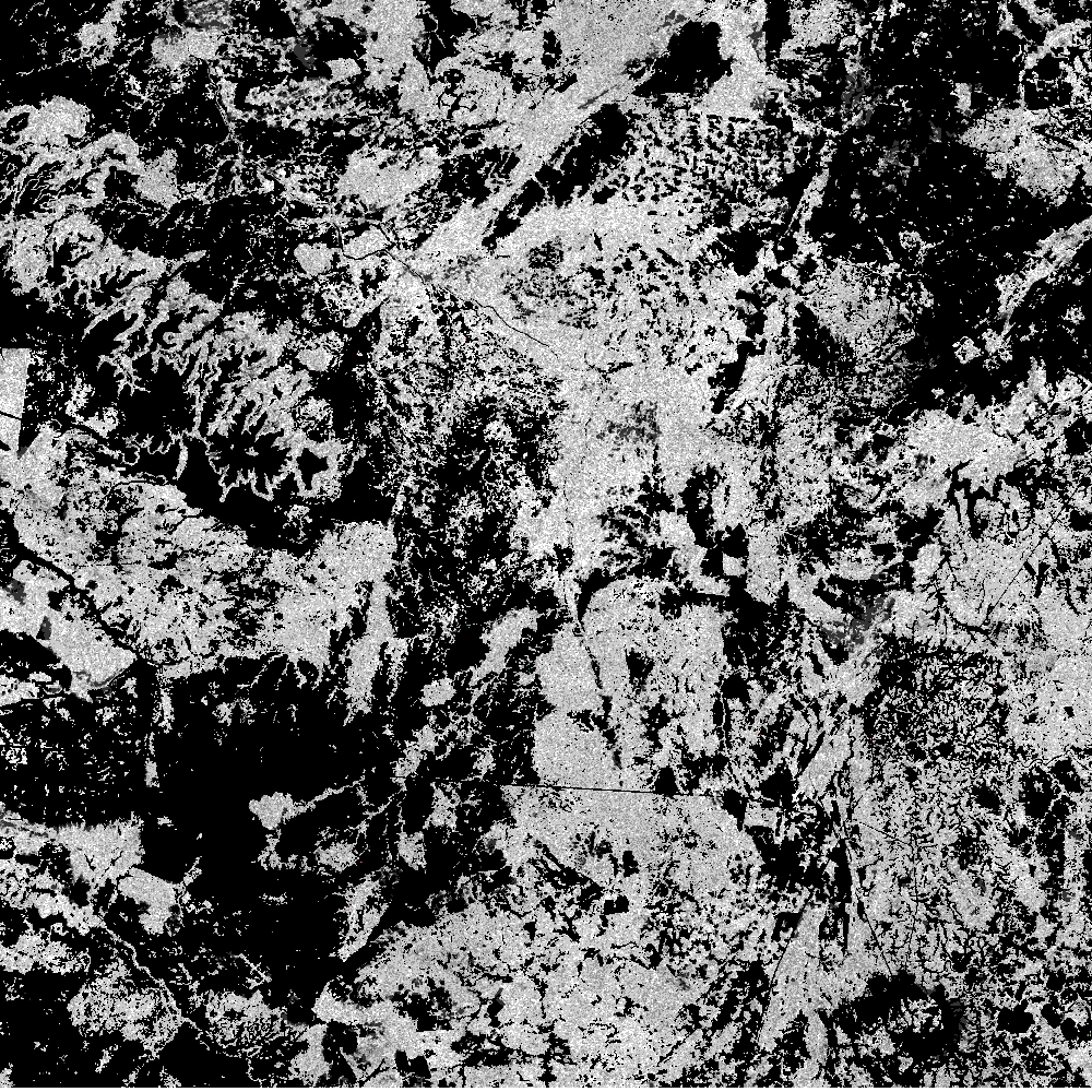
5.3. Dataset description
This data was generated with the BIOmass Tool for Alos (biota), a module written in the Python programming language to simplify processing of the ALOS mosaic into biomass and biomass change maps.
The change map here was based on a very similar process to that which we’ve just run in QGIS, including the same calibration methods. However, it differs in that any changes identified in the image must be greater than a minimum area (area threshold: connected pixels in hectares), and have a minimum loss/gain intensity (intensity threshold: proportional biomass change in %). Additonally, forest losses can only occur over a previously forested area (greater than a forest_threshold in the first image), and forest gains over a previously non-forested area (less than the forest_threshold in the first image). The images are also subjected to a speckle filter, which suppresses noise in the backscatter images.
For these change maps we set the area threshold to 1 hectare, the intensity_threshold to 25 %, and the forest_threshold to 10 tC/ha.
The resultant image contains 7 classes of data, numbered 0 to 6. These numbers represent:
| Forest change type | Value | Definition |
| Deforestation | 1 | AGB above forest threshold in image 1 and below forest threshold in image 2, with a loss of AGB greater than intensity threshold over an area greater than minimum area threshold. |
| Degradation | 2 | AGB above forest threshold in image 1 and image 2, with a loss of AGB greater than intensity threshold over an area greater than minimum area threshold. |
| Minor loss | 3 | Any loss of AGB that doesn’t meet conditions of deforestation or degradation. |
| Minor gain | 4 | Any increase of AGB that doesn’t meet conditions of deforestation or degradation |
| Growth | 5 | AGB above forest threshold in image 1 and image 2, with an increase of AGB greater than intensity threshold over an area greater than minimum area threshold |
| Afforestation | 6 | AGB below forest threshold in image 1 and above forest threshold in image 2, with a increase of AGB greater than intensity threshold over an area greater than minimum area threshold. |
| Non-forest | 0 | AGB below forest threshold in image 1 and image 2. |
The effect of this extra processing is to reduce noise, by suppressing changes of low intensity (likely the result of soil/vegetation moisture and calibration changes) and removing isolated pixels of change (which frequently result from noise).
5.4. Visualisation
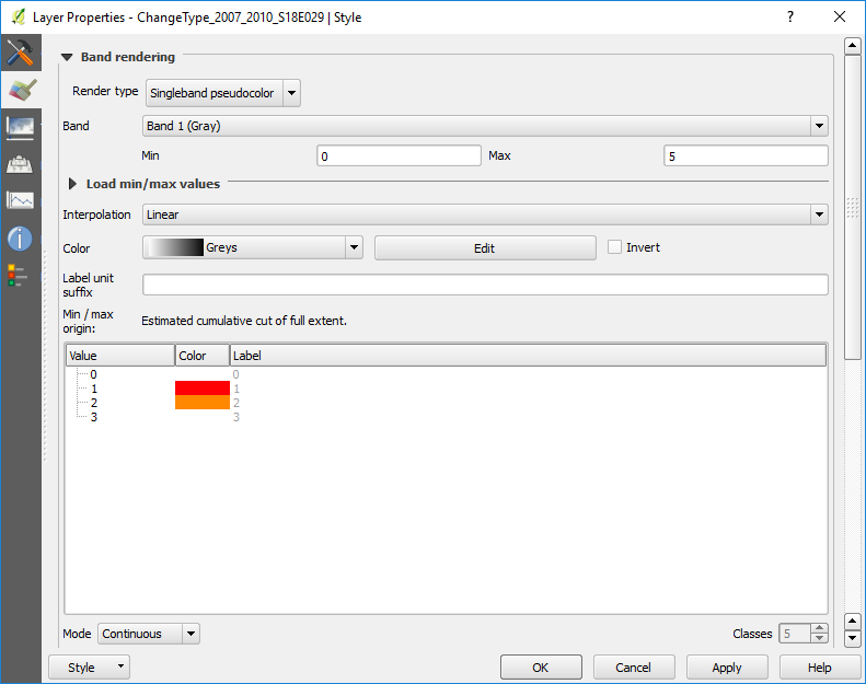
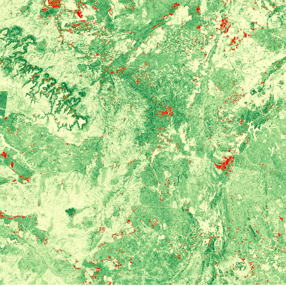
For now, we’ll focus on showing only classes 1 and 2 (deforestation and degradation), which are most often the classes of interest. Double-click ChangeType_2007_2010_S18E029 in the Layers Panel, and choose Singleband pseudocolour from the Render type pull down menu. Click the green + symbol 4 times to add four colours. Set these as follows:
| Forest change type | Value | Colour |
| Non-forest | 0 | Transparent |
| Deforestation | 1 | Red |
| Degradation | 2 | Orange |
| Other | 3 | Transparent |
Display the output image on top of your previously created biomass map from 2007 to show areas of forest loss and their context.
5.5. Questions
- How does this map compare to the one you generated? Do you agree with the assumptions we’ve made?
- Try to load in the 2007 - 2017 change map. How does this compare to 2007 - 2010?
- Build a visualisation of the growth and afforestation classes. Do you think these look realistic?