4. Identifying change
As well as producing static biomass maps, we can use L-band radar backscatter data to produce estimates of biomass change. We do this using multiple snapshots of the same location, and taking a difference image.
4.1. Loading data from 2010
Return to the S18E029 directory and repeat the procedure for ‘Mapping aboveground biomass’, but this time using the data from 2010.
Save the resultant image as something readily identifiable (e.g. S18E029_AGB_2007.tif).
Once you’re done, you should have two biomass maps, one for 2007 and one for 2010. Set an identical colour map and scale for these two images and flip between them.
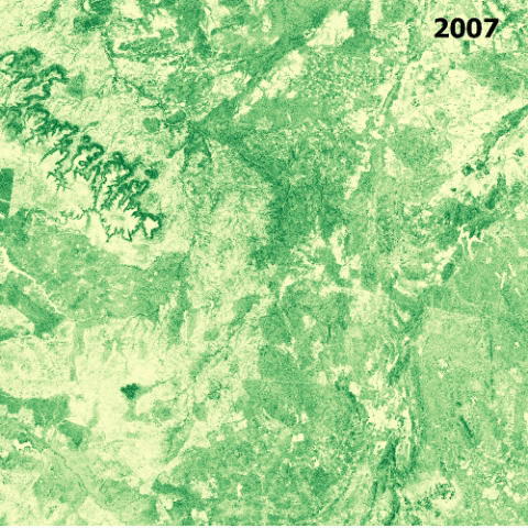
- Can you spot any locations where aboveground biomass has changed?
- What are the likely causes of these changes?
- Can you spot any changes that probably aren’t related to forest loss?
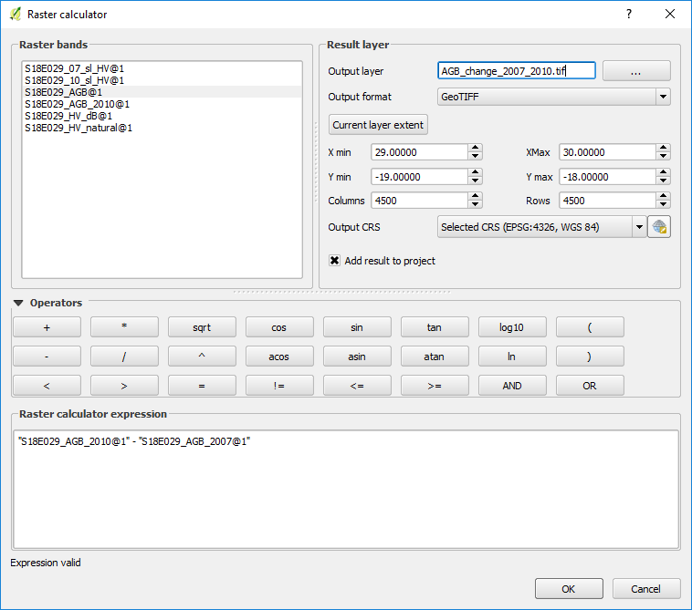
4.2. Calculating a difference image
Another way to consider change is to subtract one image from the other. Where values are negative, biomass has been lost, and where positive, biomass has been gained.
Perform the following operation:
…using the raster calculator:
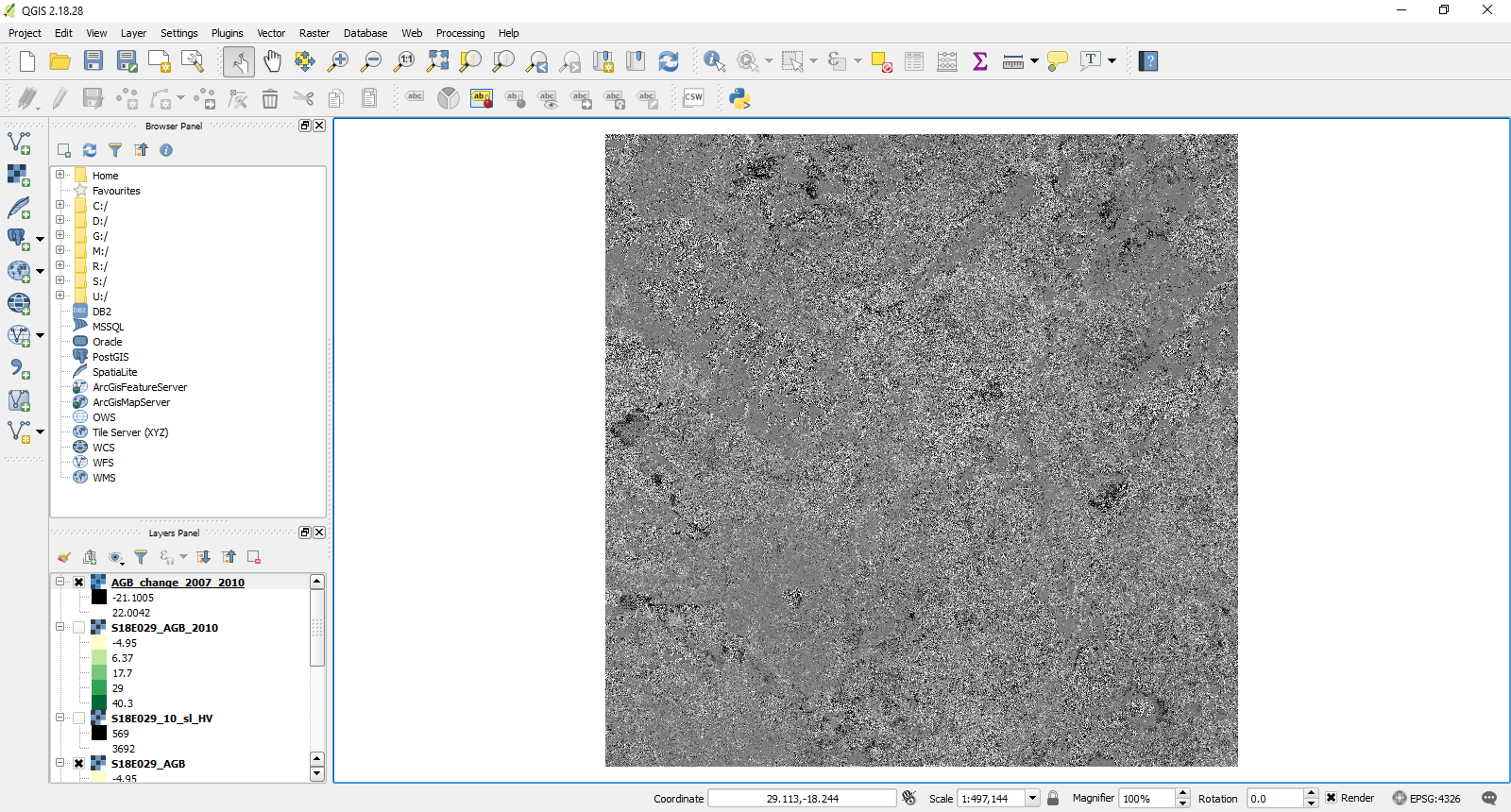
The resulting image shows areas of biomass loss in black, and areas of gain in white.
4.3. Visualisation
We can improve visualisation of this image using different color maps and limits. Here’s my effort, which shows biomass losses in red and biomass gains in blue:
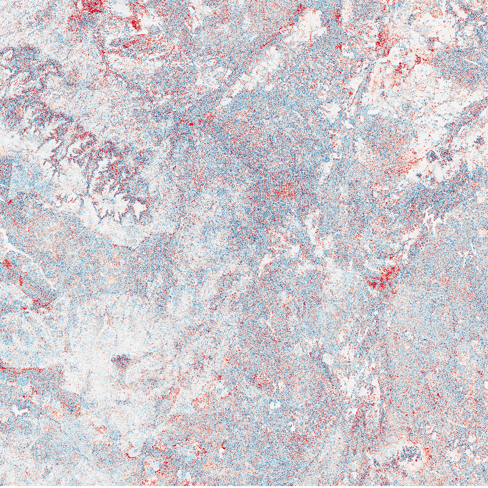
Try and experiment to find the best combination.
Advanced: Try to mask out areas of low biomass (e.g. < 10 tC/ha), which can improve the interpretabiltiy of the image.
4.4. Building a simple deforestation map
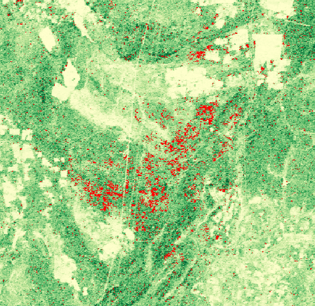
By making some assumptions, we can produce a map of deforestation. For example, we could assume that all areas that lost more than 20 tC/ha over the period 2007 - 2010 were deforested. This can be programmed into the raster calculator as follows:
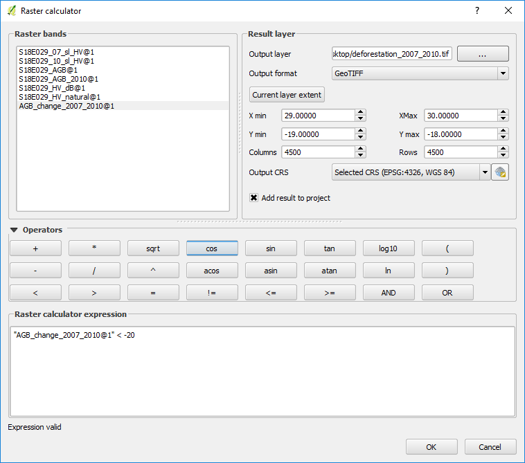
In this image, pixels with value 1 show deforestation, and pixels with value 0 show no change. If we give pixels of value 1 a red colour, set 0 to transparent, and overlay it on the 2007 biomass map, we can identify locations of forest loss. For example:
Try to build your own deforestation image, and see if you can improve on the assumptions we’ve made here.
Tip
You might improve on these assumptions with a different biomass loss value, or by taking into account a forest/nonforest threshold (e.g. 10 tC/ha).